Blog

9/18/2019 7:55:40 PM

Sealing a Traditional Wood Palette
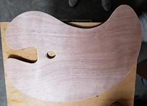
Bradford Ross / 10 Comments

 A traditional wooden palette takes a little preparation but it's worth the effort.  This is a large Richeson palette that you can get online for around $25 (dimensions are 18"x26.5).  The palette is not balanced and I highly recommend having a balanced palette as well as shaping the thumb hole for comfort.  It's a good idea to do those things before sealing so check out my upcoming blog that describes how I improved mine if you're interested.

The process of sealing the palette is easy to do during breaks from other work.  You'll need:  boiled linseed oil from the hardware store,  nitrile gloves and high quality paper towels or lint free rags (If paper towel leaves bits don't use it).

 If you want to start off with  a toned palette  you'll need Ultramarine Blue, Burnt Sienna, Yellow Ochre and a white (artist oil paint) and a palette knife (you can use a black instead of Ultramarine). I have used polyurethane to seal palettes but the old way of repeated applications of linseed oil yields a wonderful surface that improves with use.  Each painting you do becomes a part of the palette's patina.


Pour several ounces of oil on the backside of the palette and spread it evenly.  Cover the whole back generously.  I use a glove and spread it with my hand because rags or paper towels soak up and waste a lot of the oil. 

Let the oil sit on the palette for an hour or so and then wipe all excess oil off with a rag or paper towel.  Never let an oil film of any appreciable thickness dry on the surface.  

If you just want to seal your palette without a toning it, repeat these steps on the front side.  It will take five or six applications, back and front, before the wood has absorbed enough oil to function as a palette.  If you like to paint on a warm tone, this is a fine option.

If you want a neutral gray patina from the start, as I prefer, save unused paint from normal painting sessions, or just use Ultramarine Blue, Burnt Sienna, Yellow Ochre (or blue and other earth reds and yellows) and white to mix a mid-tone neutral gray.

Add enough oil to make an easily spreadable paint (softened butter consistency) and cover the front side of the palette.  Let it sit for an hour.


Wipe off the excess,  rubbing the tone in a circular motion, with a lint free rag or high quality paper towel.  If it's too tacky to rub in easily, add some oil. The goal is to have oil (and pigment) actually absorb into the wood rather than sit on top of the wood like a coat of paint. The wood should appear stained as in the image below. 


If a paint film is left to dry it will result in a gummy area that will impede mixing.  Let this patina dry for a few days.  If you want a more opaque patina, repeat.  Then follow instructions for sealing as you would the raw wood (wipe on oil with or without gray added, let sit an hour, wipe off excess and repeat daily, back and front).  If the new oil starts to remove the patina tone, wait longer to oil it. When the palette can reflect a hazy image, like the window reflected below,  it's done. 

To care for it after use,  scrape the majority of the paint off with a palette knife.   The paint that can't be removed with a palette knife can be scraped and mixed together, adding a little boiled linseed oil to release it from the wood grain and to make it mixable.  Add a little of whatever earth color,  blue or white is needed to make this slurry a neutral gray.  Then,  adding a little more  boiled linseed oil if required,  wipe off the slurry and  rub  to a polished finish.    This will allow additional patina to absorb and build up slowly over time without building up an actual layer of gray paint. 


If  you'd like a free pdf copy of this post click here.


Have fun!


I'll be adding a post on balancing your palette and making it comfortable to use soon.  The best way to keep up with this blog is to go to the very bottom left of this page (keep scrolling), find the Facebook logo and if you're on Facebook, both 'like' and 'follow' or sign up for my newsletter.  


Read More

8/29/2019 3:44:51 PM

The All Purpose Double Primary Palette

Bradford Ross / 2 Comments


I've been using this palette of colors, or something very close to it, for a few decades now and this post is actually the same thing I give to anyone who takes one of my painting classes.  With 7 to 9 tubes of paint you have an intense, full spectrum of color laid out in an order that gives you a value scale for reference.  It's such a versatile palette that I thought I'd share it.

 Place blues together on the left, then reds then yellows, then white. Leave a gap between blues, reds and yellows for mixing secondary and tertiary colors.  The colors labeled on the palette are specific to M. Graham but I've included other names at the end of this post.

To the right of the white put earth colors, Transparent Yellow Iron Oxide (TYIO) and Transparent Red Iron Oxide (TRIO).  You could add Burnt Umber beside TRIO.   Alternatively, TRIO, or better yet, Transparent Orange Iron Oxide could be used as the only earth color to simplify the palette (The fewer the colors the more mixing, which is fine).

Set up in this order, intense colors can be made by mixing each color into its immediate neighbor up to Cadmium Yellow Light.  Cadmium yellow light then mixes into cool blue on the left (Pthalo blue) to get intense greens. If you need mixed greens in your painting, add them to the line to the left of Phthalo. (Note: If you have a hard time controlling the very strong Phthalo pigments, mix greens with Ultramarine and add in Phthalo to increase the intensity as required)

This order also gives you a built in value scale beginning with darkest dark on the left (Phthalo, Ultramarine and Alizarin) and ending with the lightest light on the right (white). The mid-tone palette helps to gauge your values.  Orange equals middle value.  Squint to compare your mixes in the center of the palette to those pure pigments at the edge of the palette to gauge how light or dark you mixes are. I'll address the earth colors a little later.

Using blues and reds as an example,  we can see the logic of setting up the palette this way.  Ultramarine and Alizarin are next to each other because Ultramarine is a blue with red in it and Alizarin is a red with blue in it.  Mixing the other red and blue, the red that leans toward yellow (Pyrrol) and the blue that leans toward green (Pthalo), makes a very dull violet compared to Ultramarine and Alizarin.  If you want an even more intense violet, switch out Alizarin for Quinacridone Rose or Quinacdridone Magenta.  We need to know what our paint can do so we want to know the purest colors our palette is capable of.  Randomly placing your colors on the palette will lead to random color in your painting. 

The same idea applies to mixing greens and oranges:

If we scrape those dull secondary colors together, adding white to make it easier to see, they make a neutral gray.  They were a mix of all the primary colors and, of course, the primary colors mixed together make a neutral brown or gray.  In short, two primary colors mixed together make an identifiable, fairly intense, color.  The more the third primary is added the less intense and identifiable the color will become.  


As for the earth colors, you can consider them, along with Ultramarine Blue, a secondary palette (a triad: any three colors evenly spaced around the color wheel, like the primaries).  An example of mixing grays using earth colors is below.  Note how similar the resulting grays are to the grays mixed with the intense colors.

Again, white is added to aid in seeing the mix. Think of Transparent Yellow Iron Oxide (TYIO) as a warm yellow, Transparent Red Iron Oxide (TRIO) as a warm red.  If you choose to add Burnt Umber to the palette it functions as a cooler red than TRIO (still warm but more of true red. To cool Burnt Umber more you would add a little Alizarin). Adding TYIO to Ultramarine Blue will make grays that lean blue green-yellow green.  Adding TRIO to Ultramarine will make grays that lean blue violet-red violet.  Adding both TYIO and TRIO to UM make grays that lean blue and orange.  Adding the earth colors to their corresponding pure colors will make lower value, lower intensity, warmer versions of those colors (TYIO with Cad. Yellow Med., Burnt Umber and TRIO with Pyrrol, TRIO and TYIO with Orange).


To save paint, lay out smaller amounts of the entire palette, then when you've decided on a color scheme, lay out more of what you will be using most.  Maybe you'll only need one of the yellows or one of the blues or reds depending on what your dominant color is going to be.  Alternatively you could choose just the three warm or just the three cool primaries plus white.  Or you could paint with just the earth colors and ultramarine and white.   This palette is a great base for experimenting with other colors to make new palettes also.


For a free downloadable PDF of this palette instruction just click here.  It's also on the Classes tab at the bottom of that page.


FYI:  The gray palette in the images is a New Wave Expressionist Confidant palette, made in Pennsylvania, widely available.  I like the neutral gray kind but the natural wood version may be more durable.  My issue with the gray version is that my palette knife gouges the surface too easily.  It's a good and very comfortable palette for anyone who does not want to prepare a traditional palette.  I do prefer the palettes I've prepared myself because the surface is harder to damage but if you don't want to bother, I think these are good palettes, reasonably priced, in different shapes and sizes. 


I'll be adding a post on preparing a traditional wooden palette in a few days so sign up for my email newsletter or, more conveniently maybe, find the Facebook or Instagram icons at bottom left of this page, click, go to my pages and "like" or "follow".   If you remember to  "follow" the Facebook page as well you'll get them in your news feed but you might not if you just "like".  I'll link blog posts to those pages.


Alternative colors:

  • Ultramarine (warm blue): Ultramarine Deep, French Ultramarine, Cobalt (a true blue but not a blue-green)
  • Pthalo (Phthalocyanine Blue)(cool blue): Prussian Blue (less intense), Viridian, Pthalo green
  • Alizarin (cool red): Anthraquinone Red, Quinacridone Rose (my favorite but a slower drier)
  • Pyrrol Red (warm red): Cad. Red, Cad. Red Light, Napthol Red/Red Light, Permanent Red Light
  • Cadmium Yellow(warm):  Permanent Yellow Med., Hansa Yellow Med., Cad Yellow Med.
  • Cadmium Yellow Light (cool):  Permanent Yellow Lt.,  Hansa Yellow Lt.
  • Transparent Yellow Iron Oxide: Transparent Earth Yellow, Yellow Ochre (semi-transparent to semi-opaque), Raw Sienna (semi opaque to opaque)
  • Transparent Red Iron Oxide: Transparent Earth Red, Burnt Sienna (semi-transparent to semi-opaque)
  • Add Burnt Umber as a dark, low intensity red (fast drier! Use only in alla prima or underlayers)
  • Try Raw Umber as a cool, very dark yellow (fast drier! also use only in alla prima or in underlayers)


Read More

8/15/2019 3:54:22 PM

A Journey of a Thousand Miles...

Bradford Ross / Comment on this

I haven't written a blog post for several years now.  There are many reasons for this but I think the most important factor is the word should.  Every time I thought about writing something that word should loomed.  A blog should be informative and useful to a known audience, should be entertaining, should have a schedule, should not be just self promotion.  The list could go on and on.  Good advice is everywhere.  Sometimes a whole lot of good advice can be an impediment to ever starting anything. 


I was painting in Ocean City Maryland recently and a woman asked me, very apologetically, if I would mind a few questions?  The bottom line was she loved painting but had stopped long ago as a result of a very critical family environment.  She wanted to start again but it all seemed too complicated.  Where to start? 


First of all, make it easy to start.  Simplify your equipment so you can get to it and set it up when you have a spare half hour.  I use a 6x8 thumb box that I can use anywhere and you can buy or adapt all kinds of small accessories (small jam jars, saw the handles off of some brushes, etc.) Work small.  Simplify your colors.  Use the three primaries and white, or use just one or two primaries with white, or several related colors and white, or use an earth color, blue and white.  Have fun for half an hour and don't labor over anything.  Keep it simple.  Write notes to yourself about what happens when you mix colors or spread them thinly, dilute them or lay them on thickly. Relax and have fun. You can't paint if you're stressed out about it or you're trying to think about too many things at once.  Start something and pay attention to what happens. That's how you learn.  That's what I'm going to do with this blog too.  So please do check it out again.  I hope to add something once a week or so.  


Read More